|
|
||||
|
American Film Company Logos But Were Afraid To Ask by Rick Mitchell Page 8 - Universal |
||||
 |
||||
There is some question about the extent to which Universal used a logo in the silent days. Most surviving prints that have what appear to be the original credits open with "Carl Laemmle Presents". However a stylized globe with the legend "Universal Pictures" extending out and below it three dimensionally, found by former Universal Research Dept. head R.A. Lee as an advertising logo from 1925, was used on some Twenties films, notably "The Cat And The Canary" (1927). The spinning globe with the legend "It's A Universal Picture" appeared at the end of some of the films; in "Wild Blood" (1928), this dissolved to an irised portrait shot of Uncle Carl and a title inviting the audience to write and tell him how they liked the picture! In a way, it would seem natural that the monoplane flying past the globe and wiping on the title "A Universal Picture" would have been done at a time when the sound of the plane could be heard but I’ve not been able to find any verification of its use before 1932. The end credit version may have actually predated the main title one. Initially this was reduced in size with a ray of light falling on the globe and the legend "It's A Universal Picture" superimposed over it; later the ray was dropped and the globe full framed. Again, there is no documentation as to when this logo was first used; the earliest picture the author has seen it on is "Dracula," released in February, 1931. In that film's original version, the end logo was interrupted by a cut to Edward van Sloan standing before a theater curtain and warning the audience that such things as vampires do exist; this was removed due to the objections of some religious groups, leaving a jump cut in the logo. The opening logo was in use by 1933 and both logos were subsequently used until 1936 when the Laemmles sold the studio. The new owners originally did not have a logo, opening their pictures with "The New Universal Presents..." Shortly, the plexiglass globe designed and built by future art department head Alexander Golitzen was photographed by John P. Fulton,ASC's special photographic department and Jimmy McHugh wrote his fanfare for it. A color version of this logo was never done, though a sepia tone version was used on the Walter Lantz cartoons the studio released prior to 1946. A static painting of the logo was used on the studio's first official three-strip Technicolor film "Arabian Nights" (1942) and no logo was on its subsequent color films. In 1946 Universal merged with the International Pictures Company of William Goetz and Leo Spitz, who had previously been releasing through RKO. A new logo was designed, a spinning globe against a background of stars over which was matted "Universal International". Initially the logo was accompanied by the ringing bells which had accompanied International's logo. This new logo was done in both black-and-white and color. The Universal-International logo did not have to be changed for "wide screen" projection as it fit within Universal's chosen 1.85:1 and 2:1 ratios. A special 3-D version was done for "It Came From Outer Space" (1953) but was not used on the company's subsequent 3-D films. A CinemaScope version was done in 1954, which dissolved to a card reading: "A CinemaScope Production" with the official CinemaScope logo against a background of clouds; Universal was the only studio other than.Fox to set aside a separate special artwork card for CinemaScope. In 1959, after the company was saved from closing by the sale of the studio lot to MCA, the globe and lettering were reduced in size and "Edward Muhl, head of production" added below and to the left of the frame. In 1962, MCA bought Universal's parent company Decca Records. "International" was dropped from advertising but the Universal-International logo, was kept until the introduction of a new one with "Charade" early in 1964. This logo, created by Universal Title and Optical, had the camera zooming through a starfield toward a spinning earth surrounded by out-of-focus rings like those of Saturn. These came into focus along with the.title: "A Universal Picture" or "A Universal Release". Edward Muhl's credit continued to be used until 1967. In the early Seventies, at the insistence of Lew Wasserman, the copy was changed to: "Universal-An MCA Company". For the 75th anniversary of the founding of Universal City in 1989, a new logo was done by The Chandler Group, the first of any company's to be mastered in 65mm. The anniversary version began with quick glimpses of the earlier logos, minus the Universal-International one for some reason, shown at 1.33:1 then cutting to the new version, in 1.85:1 or full anamorphic. That version was only used on the company’s 1989 releases, with just the new version used until the summer of 1997, when another version, designed to the specifications of the company's then new owner, Seagram's (and resembling the "Genesis" project in "Star Trek II"), was introduced with Steven Spielberg’s "The Lost World: Jurassic Park 2." Variations of the Universal logo: Alfred Hitchcock was not required to use the logo when he began making pictures for Universal in the Sixties. "The Birds" (1963) opened with a static painting of the globe accompanied by: "Universal Pictures Presents"; his subsequent films opened with a card reading: "Universal Presents". George Roy Hill was allowed to open "Slaughterhouse-Five" (1972) with "Universal-An MCA Company" over black and later to use the plexiglass globe to open "The Sting" (1973) and the monoplane version on "The Great Waldo Pepper" (1974). Marty Feldman used, and spoofed, the plexiglass globe in opening "The Last Remake Of Beau Geste" (1977) and the monoplane was used on the tv clip show "Funny Business" (1978); for the opening of "Sgt. Pepper's Lonely Hearts Club Band" (1978) animated bomb bursts in color, with accompanying explosion effects, were added to the monoplane logo to tie it in with the film's opening sequence, set on a World War I battlefield. This logo was also used on George Romero’s recent "Land Of The Dead" (2005). Variations on the current Universal logo occurred in "Streetfighter" (1994) where the logo dissolves to the Streetfighter logo, and "Waterworld" (1995), where the copy dissolves out to a view of the world on which the polar ice caps melt and water floods the land. |
||||
|
|
||||
|
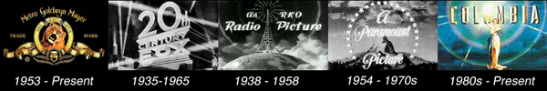
Page 1 - Introduction Page 2 - MGM Page 3 - 20th Century Fox Page 4 - RKO Page 5 - Paramount Page 6 - Warner Bros Page 7 - Columbia Page 9 - UA, Republic, and others |
||||
|
Home / Features / Film Sound / Movie Props / Locations Trivia / Events / Tributes / Recommendations / Blog / About Bibliography / Links / FAQs / Shop / Message Board / Disclaimers / Site Map |
||||
Please support our site by visiting our affiliates: